We’ve come a long way since the World Health Organization and UNICEF Joint Monitoring Programme [better known as the JMP] started tracking progress on Water, Sanitation, and Hygiene goals in 1990. At that time, only 76% of the global population had access to an improved water source and only 54% had access to sanitation facilities.
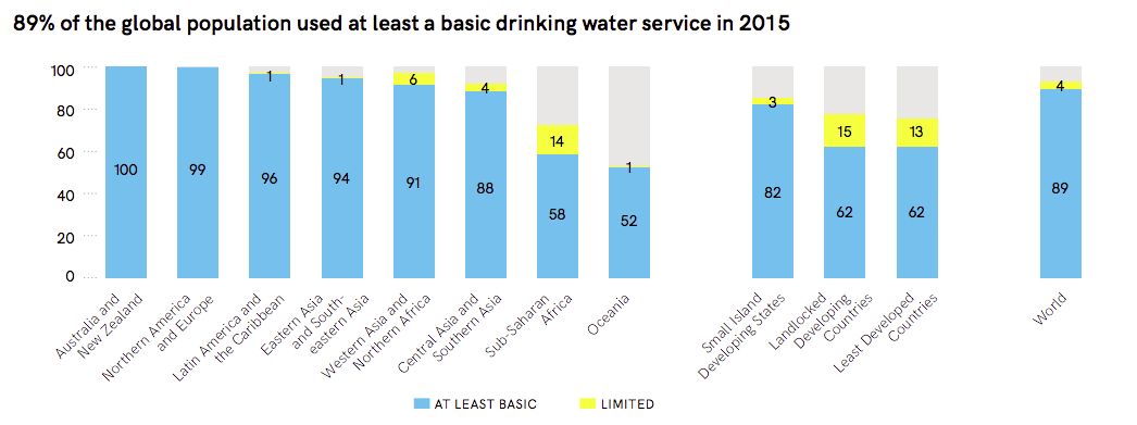
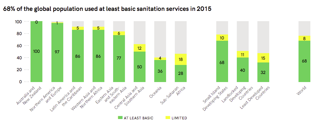
According to the most recently available data from the JMP in 2015, 89% of the global population has access to at least a basic drinking water source. And 68% of the global population has access to basic sanitation services.
A little warning, before you go further. We’re going to get technical with our Sustainable Development Goal Ladders of Service definitions… so if you need a reminder of specifically what that means, take a peek at an earlier installment of our series: WASH 101: A Shared Language.
We can be proud of our progress towards ensuring universal access to WASH services. But global statistics have a way of masking disparities that continue to persist. If we’re going to truly understand the global water crisis, we have to confront these disparities. We need to admit that access to clean water and sanitation greatly depends on where you live and how much you make.
Let’s start with geographical disparities between regions of the world.
For the purposes of tracking progress toward Sustainable Development Goals, the world has been divided into 8 regions. The JMP’s 2017 update reveals staggering gaps between these regions. In terms of access to water, Australia & New Zeeland boast 100% access. At the same time, in Oceania, only 52% of the population have at least basic services.
Let’s make sure we notice that these reports use the benchmark of “At Least Basic” – which isn’t the goal. Our goal is for water services to be “Safely Managed”, but showing that graph is highly depressing. While Australia & New Zeeland still stay in the lead with 100% safely managed drinking water, less than 25% of people living in Sub-Saharan Africa have access to that level of service.
If we want to look at access to sanitation services, we run into the exact same trend. Australia & New Zeeland are again at 100% basic access while Sub-Saharan Africa is only at 28% access.
If we zoom in closer to look at disparities between countries, we see the divide deepen.
Let’s look at two countries that most 20 Liters supporters are familiar with – the United States of America and Rwanda.
In the United States of America, in 2015, 99% of people had access to safely managed drinking water. More specifically, that means that 99% of the population had access to water piped into their homes, available when needed and free from contamination. This is by no means perfect. In the past several years, we have become painfully aware that we shouldn’t take clean water for granted in the U.S.
But by comparison: In 2015 in Rwanda only 57% of the country had access to basic water services. “Basic” service means that the person had access to an improved water source within 30-minutes roundtrip of their home. A whopping 13% of the 11,610,000 people who live in Rwanda had water accessible on the premises of their home. That doesn’t change the fact that 0% of the people living in Rwanda are considered to have access to safely managed drinking water.
If you’re hoping for smaller disparities in the availability of sanitation services, you will be disappointed. In the United States, 89% of the population has access to safely managed sanitation services. This jumps to 100% for access to at least basic sanitation services. In Rwanda, 0% of the population has access to safely managed sanitation services. 62% have at least access to basic services.
If you want to look at data from another country that matters to you, check out the live mapping at washdata.org/data.
Finally, we can look at the disparities within a country and see that geography and economics also expose inequality.
Let’s look at how these trends play out in a country like Rwanda. Overall 57% of people have access to basic water services. However, 79% of the wealthiest people have this level of access as opposed to only 50% of the poorest people in the country. Of the wealthiest, 64% have access to basic sanitation services while only 35% of the poorest can access that same level of service.
There is a similar divide between urban and rural populations. 77% of urban populations have access to basic water services compared to 49% of rural populations.
I could give you 1,000 more examples, but I think you’ve got the idea.
So, the ultimate question becomes, what should we do with this knowledge? I believe we must ask more questions. We realize there are no simple solutions that are going to work immediately and effectively for every community. The global water crisis is a complex problem that is going to require a myriad of solutions. So join me for our next post – as we begin to look at some of the available solutions.
Please note that all of the statistics used in this post were found in one of these two reports from the JMP – either the Progress on drinking water, sanitation and hygiene: 2017 update and SDG baselines report or the Progress on sanitation and drinking water – 2015 update and MDG assessment.